Decipher my Data, Flu! Final evaluation report

Click the picture to access to the full report

Click the picture to access to the full report

After two years, we have written an evaluation report to find out what worked and what didn’t work with “Decipher my Data: Flu!”

The project wasn’t successful in terms of the number of schools involved or the amount of interactions.  However, Dr Rob was able to complete his analysis of the data provided by twenty-seven schools over the 2 school years and he wrote an academic paper to be submitted to different journals. Still, as it usually happens in real science, the results aren’t completely conclusive and more research is needed in the area.

Considering all circumstances, Decipher my Data: Flu! has served us as a pilot for future Decipher my Data projects. We now are aware of its weaknesses and strengths, which we will put to good use.

If you are curious to read the full evaluation report, you can find it here (PDF).

Posted on by modangela | Leave a comment

The End of Data Collection – so what happens next?

Summer time for everyone!

Now that we’ve entered the summer term it’s time to stop collecting the weekly school absence data. Did I just hear a sigh of relief? The national data suggest that whilst there is still small amounts of flu circulating, levels are low, so it’s a good time to end this part of the project.

To be honest, data collection is always a bit boring. To epidemiologists, we’re about to enter the most exciting part of the research where we get to start analysing THE COMPLETE DATASET! So now is a great time to get your spreadsheets dirty and decipher our data.

There have been some great lab logs and we’ve had an excellent report submitted already. I’d love to hear from other schools about your insights into what’s been going on in your area. I’d also be very happy to help with any questions you might have about best to analyse your data. It’s also worth mentioning that whilst we’re no longer collecting data each week, it’s not too late to upload your historical data if you haven’t done so already (or send it to Emily, and she will upload it for you). The more data the better!

The next few months are going to be really busy for me. I’ll be meeting with experts here in my department to work out the finer points on how to analyse the data and they’ll be helping me to interpret the findings. I’ll aim to keep you updated with progress as we work through things. The plan is to get everything finished around August, ready to submit our results for publication in a scientific journal by September.

The fact that the peak in the national flu data occurred over the Christmas school holidays will make our analysis that much more difficult. But I’m still hoping we can go some way to answering the main research question: can school absence data detect flu peaks early?

Posted on by Dr Rob | Leave a comment

Investigating the epidemiology of flu, Big Brother style

In these LabLogs I’ve talked endlessly about how we can’t predict the start of an influenza outbreak. Despite this, you might be surprised to learn that there are many things still to learn about how influenza is transmitted from one person to another.

When someone with influenza sneezes they produce big bits of snot that tend to settle on surfaces that get touched by other people. Smaller particles are also produced by the sneeze and can hang around in the air as what we call aerosols. Importantly, we don’t really know the relative amount of how much influenza is spread by these two different processes. The reason this is important is that it could help us understand the best ways to block the spread of flu.

Surprisingly, to understand this, Professor Van-Tam and his team have been deliberately infecting a group of volunteers with flu and then putting them in a Big Brother type environment with other non-infected volunteers and measuring how the virus spreads.

All volunteers were asked to regularly wash their hands in order to make sure they didn’t get infected by touching contaminated surfaces. Importantly, the non-infected volunteers were split into two smaller groups: one was given a protective visor to cover their whole face and the other wasn’t.

We know there are three possible ways that flu can spread from person to person:

  • Aerosol – these are the small particles containing the virus, which in this experiment can easily be drawn around a protective visor. All volunteers in the experiment could get infected in this way.
  • Droplets – large particles of snot that hit the protective visor but won’t be drawn around it. Only the volunteers not wearing a visor could get
    infected this way.
  • Contact – coming into contact with contaminated surfaces that have been sneezed on and then touching mouth/eyes/nose. Because of the frequent hand and surface washing, none of the volunteers should get infected this way.

By comparing the number of healthy volunteers infected the between the two groups it’s then possible to calculate the contribution of aerosols and droplets in the spread of flu.

Unfortunately we don’t know the results of the research yet, but when we do it could change the sorts of protective equipment used to look after patients infected during a flu outbreak. If the aerosol route turns out to be important then doctors and nurses will be given a respirator to wear when looking after a sick patient. I’m looking forward to reading about what Prof Van-Tam and his team find, and it’s certainly one of the more interesting experiments I’ve seen on flu for a while!

Posted on by modemily | Leave a comment

The Bigger Picture

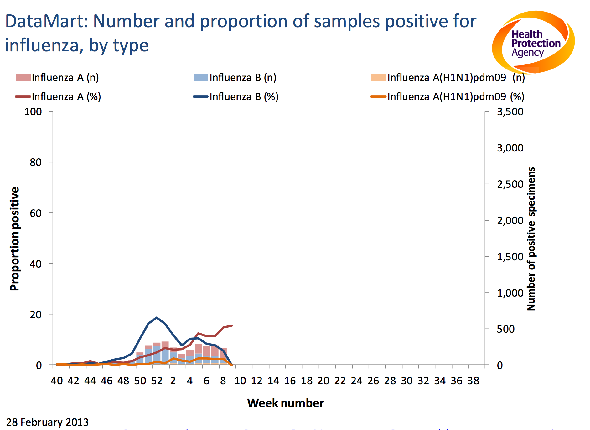
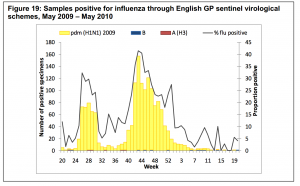
Graph showing the number and proportion of samples positive for Influenza A and B. Graph taken from the HPA weekly influenza report week 8.

The flu season has been as unpredictable as ever this year; in this blog Dr Rob looks at data from the UK and across Europe to try and understand the bigger.

I’ve said it before, and I’m sure I’ll say it again, but flu seasons are unpredictable. This year has been no exception: there was a relatively small peak in December, then the number of cases went down in the New Year.

In week four our school data looked interesting as it started to go up again and in week seven the national data showed a slight increase. We don’t know what the school data for week 9 shows yet, but it will be interesting to see what’s happening now that schools are back from half term.

So is the flu season over or can we expect another peak? At the moment there’s some evidence for both possibilities.

As some of you will already know, there are two main types of influenza virus (A & B). Every week samples are taken from people with symptoms of flu in hospitals across the country which are then tested for influenza and other viruses found in the lungs. The results of these tests tell us about the proportion of people with ‘flu like symptoms’ that actually have viruses in their bodies as the cause of their illness. Interestingly, the proportion of positive samples for influenza A have been gradually been going up over the last few weeks, with most of what we’ve seen so far this year probably being due to influenza type B.

This gradual rise in influenza A might suggest that we’re about to see another peak. On the other hand though data from across Europe (collected using methods comparable to here in the UK) suggest that whilst most countries have currently have flu circulating in the community, there were more countries with decreasing rather than increasing levels during week eight. These data give us the bigger picture, but what’s going to happen during the rest of the flu season? I don’t know, but watch this space and your data to find out.

Posted on by modemily | Leave a comment

The week four blip

In week four there was an increase in the number of school absences, similar to a peak just before the Christmas holiday. Was this due to flu, or are there other possible explanations?

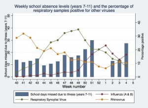
Weekly school absence levels and the proportion of respiratory samples positive for other viruses up to week four

It would be fair to say that Shane and I had a fairly nervous but exciting telephone conversation last week. Our absence data for week four was showing a peak similar to the one just before Christmas when the levels of flu from national surveillance systems were high. Did this new peak suggest that we were about to see a second peak in flu this season when the national flu indicators were all still low?

HPA swine flu graph

Graph of swine flu data showing a peak just before the school holidays and another peak just after school return. Graph taken from the HPA National Influenza Annual Report.

This wouldn’t be the first time that there’s been a second peak of flu in one season. During the swine flu pandemic, levels of flu were very high just before the summer holidays. Schools broke up, levels dropped during the holidays, and  then peaked again a couple of weeks after the start of the new school year in September. These and other results show just how important we think schools are in the spread of flu.

So what’s going on during week four in our schools data? Before epidemiologists consider something as being a real effect, or truth, we like to consider some other possible explanations for our findings:

  1. Error – did someone accidently put in the wrong data for that week? This is a possibility, but all schools submitting data at the time showed an increase, even if some were greater than others.
  2. Chance – could the blip be due to a fluke in the data? When I first looked at the results, the peak was quite large, but we were not sure whether it was truly higher than background levels. As more schools have submitted their data, the peak has gradually come down closer to the background levels (you can see the live data here) and we still cannot be certain that it is really different to the background levels.
  3. Bias – are the results from schools taking part in decipher my data different in some systematic way from other schools around the country? Are they better performing academically? Are they in less deprived areas? Are they all in the South of England? I’m going to examine some of these issues in detail over the next couple of weeks and don’t have any definite answers yet as new schools are still beginning to join the project.
  4. Confounding – is there an alternative factor that explains the peak in school absence data other than flu? We don’t collect information on the illness, so could the blip in data be due to something like Norovirus (there’s lots around at the moment) or another respiratory infection like RSV?

So there are a few possible alternative explanations for the blip and right now the honest answer is that I’m not sure whether it was really due to flu or not, but my feeling is that it was due to chance. This little bump in the data has given me a lot to think about though especially as the national flu data was quite low during that week and I’m certainly going to be watching the data closely over the next few weeks to see how things progress.

Posted on by Dr Rob | Leave a comment

Interesting things happening over on the X-Y scattergraph

There seem to be some interesting things happening over on the X-Y scattergraph with a good correlation appearing in the school size graph. Whilst there seems to be little correlation occurring between any of the other variables and illness rates, there does seem to be a positive correlation with school size – it’s possible that larger schools have higher rates of absence-due-to-illness.

There is a fairly good correlation between school size and illness absence during the second half of November and early December while absence levels are still broadly fluctuating around the background (and as such you would expect the greatest error in the results). The really interesting thing that seems to happening at the moment is that this correlation disappears during the peak of the illness absence just before Christmas when we might have otherwise expected the strongest correlation.

This could be down to chance or any number of confounding factors in the last week of term. The only way to know that what we’re seeing is genuine is to get more data points:

If you’ve been waiting for something to happen before uploading your school’s data, now is the time!

I for one would be really interested in hearing people ideas about what might have caused this collapse in correlation in the peak weak.

Posted on by modemily | Leave a comment

Missing data from one of the most important weeks of the year

Last flu season the project might have observed historic low levels of ‘flu but on the up side, I got a whole season free of illness. This time around it seems as if I’ve been ill with one thing or another since the start of December and I’m still trying to shake the remnants of the illness my best friend’s son had been incubating for me when I went to visit in the New Year. When I logged in to Decipher My Data after the holidays I thought to myself “there certainly better be something to show for it!

The good news is that we have a flu peak, the bad news is that just like last year, the data seems to have been peaking in the run up to a holiday so we’re potentially missing data from one of the most important weeks of the year. Our school has been following the national trend quite nicely and it seems as if I have been personally following the national trend as well! At first glance it looks like the national peak this year has been quite broad compared to previous years but Dr Rob thinks this is just down to our narrower graph range.

Data is coming in now from the most important weeks before Christmas and it looks as if the worst is definitely behind us. My classes will be getting onto the Microbes and Disease topic in the next month or so. It’s a relief to have a ‘flu peak this year a little bit earlier as last year we didn’t see the modest one we got ’til the middle of February. This will make it much easier for my students to use the data this year.

Posted on by modemily | Leave a comment

Drawing DecipherMyData graphs – proceed with caution.

The way a graph is drawn can have a big influence on how the results are interpreted. In this lab log Dr Rob discusses some of the dangers in drawing graphs with DecipherMyData .

Most of the analyses we’ll be doing in DecipherMyData involves drawing graphs as there aren’t many statistical tests we can perform to help us investigate whether the project has worked or not. Instead we’ll describe the associations we see (or don’t see) between the school absence data, measures of flu or other viruses.

One of the risks when analyzing data with graphs is that you can come to very different conclusions just by drawing the graphs in different ways, and not because of any changes to the data.  This is easiest to explain with an example, so here’s a simplified version of the graph I created in my last lab log.

A simplified version of the graph I used last week showing school absences and flu levels

A simplified version of the graph I used last week showing school absences and flu levels

I think this graph shows some association between our school absence data and flu, particularly in the later weeks.

However, I can make the association look much weaker by changing the scale of the axis for the school data (the y-axis on the left) like this.

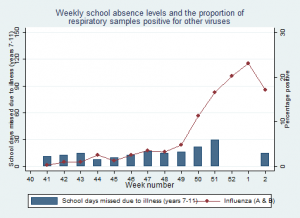
Changing the left hand y-axis on this graph to reduce the association between school absence and flu

Changing the left hand y-axis on this graph to reduce the association between school absence and flu

And if I remove the first few weeks of data on the x-axis, but keep the original y-axis scales.…

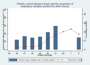
Changing x-axis to exaggerate the relationship between the schools data and flu.

Changing x-axis to exaggerate the relationship between the schools data and flu.

I think this makes the association between the school absence data look stronger as it gets rid of bumps in the school data that we see at the beginning of the year.

Unfortunately there’s no right or wrong answer for choosing how to present your results, but some ways are clearly more truthful than others. It’s also possible to get this wrong by accident if you’re not careful.

There are no hard and fast rules when putting together graphs like the ones above (epidemiologist call them time series graphs), but here are a couple of things I think about:

  • What scale for the axis? This is important, and sometimes involves drawing the graphs several times with different scales to see how they look. In general the scale should always start at zero, and go slightly higher than the largest value.
  • How much data to include? It’s important to present all the data that you have, but balanced against the fact that too much data makes a graph over complicated. In general simpler is better, but think carefully about what not to present.
  • Should you present the data as bars or lines? This is a matter of preference, but in general I try to use bar graphs for time series data. However, when there are lots of data points (like in the previous graph) then lines are more appropriate otherwise the graph becomes confusing.
  • Is it ok to use scale breaks? A scale break is an intentional break in an axis that can be used to improve the readability of data. These are usually inappropriate as they almost always exaggerate associations between data, so I tend to avoid them wherever possible.

If you’re interested in this topic there’s also a great Wikipedia page on misleading graphs that’s worth reading.

I’d love to know what you think about my graphs. Do you think I’ve chosen the best scales and axis for the data? Should I have used a scale break or not? Have a put too many things on the graphs?  Let me know in the lab logs or writing a comment on mine.

Posted on by Dr Rob | Leave a comment

Deciphering the data – influences of other viruses on absence levels

Infections other than flu could influence the school absence data. In this post, Dr Rob looks at whether two other common viruses influence DecipherMyData’s results.

As some of you highlighted in the LabLogs, a big limitation with our school absence data is that we don’t collect information on the reason for school absence. So an important question for us to ask is: are there any associations between other infectious diseases and the illness absence levels?

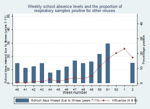
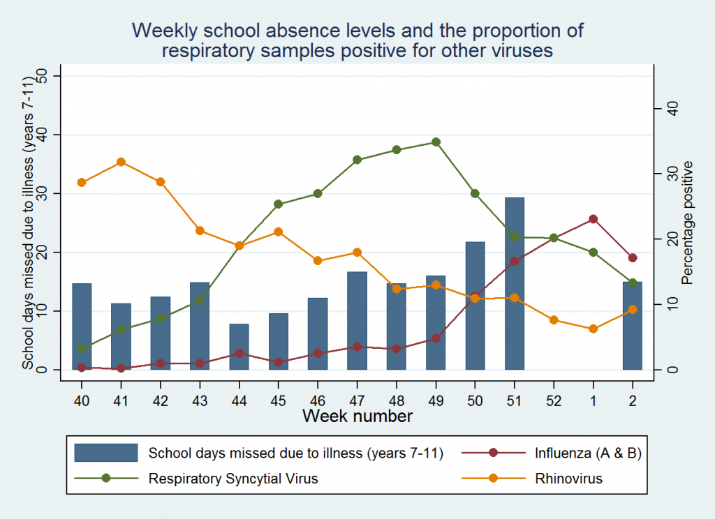
Weekly school absence levels and the proportion of respiratory samples positive for other viruses

Weekly school absence levels and the proportion of respiratory samples positive for other viruses

There are plenty of other diseases for us to look at, but a good starting place is other common respiratory viruses. Two of these are rhinovirus and respiratory syncytial virus (RSV) and fortunately there’s also good data collected about each one.

Each week the Health Protection Agency collects the results of tests performed for respiratory viruses in selected hospitals across the country. Using these data they then calculate the proportion of people tested for which a virus was detected. As the proportion of people with a virus goes up, the more of a virus there is going around.

In the graph above I’ve plotted our school absence data against the proportion of tests positive for influenza, rhinovirus and RSV each week. The data is all available online, but to save you going through each report (like I did!)..

I’ve put the results in a spreadsheet here.  That way you could plot your school’s data against levels of the three viruses.

Looking at levels of the three viruses: rhinovirus levels have generally been going down since week 43; RSV levels started off around 10, peaked at 35 in week 49, and decreased since then; influenza levels started off very low and peaked at 23 in week 1.

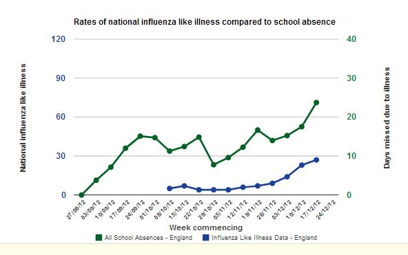
Our school’s data bumps around at the beginning of the year and at the moment shows a peak in week 51 just before Christmas. We then had school holidays during week 52 and week 1 (so we don’t have any data) and when schools come back it drops back down a bit.

What can we conclude? Well, I think the results are interesting but not conclusive. There doesn’t appear to be much of an association with rhinovirus or RSV, but some association with influenza, particularly in the later weeks.

That’s exciting as it suggests are results are doing the right thing – being associated with influenza but not with RSV or rhinovirus. However, at the moment the school data varies a lot at the beginning of the year, which means that the peak in week 50 and 51 could just be the data bumping around, especially as we don’t have many results in week 50 and 51 so these results in particular could be due to chance. As more data are uploaded, this random variation will probably smooth out, and we’ll be able to be more certain about whether there really is a peak or not.

Further analysis will also involve looking for associations with other measures of influenza (we already plot it against the GP data on the website, but there are other sources we will use) as well as looking for associations with other infections such as Norovirus. If you look at the associations with your school data and other infections, don’t forget to let me know what you find in the LabLogs.

Posted on by Dr Rob | Leave a comment

The big news this month..

“It’s tricky to know which way the levels will go over the next few weeks, they could go up or down”

The Flu season has officially started. We’ve noticed that over the past three weeks there has been a reported increase in the number of people visiting their GP with flu like symptoms. The greatest number of those visiting has been children aged 1-4, followed by 5-14 year olds, which shows that there’s almost certainly flu in schools.

While it’s not been a dramatic start to the flu season, with big rises in the number of cases, the data does suggest that there is more flu around than there was at any point last year.

It’s therefore a very important time for DecipherMyData, as we will be able to test our hypothesis of whether school absence data can detect flu peaks early. The graphs on the website really do look promising, but the number of schools who’ve uploaded data so far is small, which means we still need your data! We need your students to analyse the data and write LabLogs. Let me know if you think my hypothesis is working or not? Does you data show a lot of absence from your school? Is it flu or Norovirus?

Now that schools are back, it’s tricky to know which way the levels will go over the next few weeks, they could go up or down. So I’ll be watching our data and the national surveillance reports like a hawk, to see what happens. If I find anything interesting I’ll post it on the blog, and remember to leave LabLogs so I can see how your school is getting on.

Posted on by modemily | Leave a comment

Are there early patterns appearing?

"We’ve noticed is a massive spike in year 10′s absence data one week. This has resulted in a mini investigation." Image by Julo, Wikimedia.

“We’ve noticed is a massive spike in year 10′s absence data one week. This has resulted in a mini investigation.” Image by Julo, Wikimedia.

The first half term is down and things are slowly warming up. Already we’ve fallen into what appears to be a similar pattern of background illness levels to last year after very low illness levels at the start of the year.

My classes have not yet got onto a microbes or disease topic so things are fairly quiet here. I’ve shown the flu graph to our science club students and we’ve had a chat about some of the early patterns that are appearing.

The most unusual thing we’ve noticed is a massive spike in year 10’s absence data one week. This has resulted in a mini investigation. On my part, I’ve headed back to our absence administrator who’s helpfully downloading from the scripts that ‘Decipher my data!’ have provided for us to check there wasn’t a typo in the data set. I’ve also written a LabLog about our observations from the first half term.

In the mean time, the science club students are off asking around and I’m hoping they’re going to come back with some ideas about what happened.

From here on out I’ll be looking at the data more regularly with them as it would be better to catch this kind of thing as soon after it happens as possible.

Posted on by Katie Tomlinson | Leave a comment

Missing data – the silent problem that’s finally causing a noise

Systematic reviews of research give more reliable evidence of the benefits and risks of treatments, yet they are often hampered by missing data. Dr Rob joins others in calling on drug companies to publish all their data and reassures that this project will too.

Researchers carrying out a recent systematic review on Tamiflu weren't able to get all the data they required for the research. Creative commons image by kanonn.

Researchers carrying out a recent systematic review on Tamiflu weren’t able to get all the data they required for the research. Creative commons image by kanonn.

I recently wrote about the fact that some of my colleagues had come down with a cold, and that I was feeling rather lucky because I was fine. Well, last Friday I developed a headache, sore throat, runny nose, and spent the weekend at home feeling miserable.

I didn’t feel the need to go and see my GP and get some medicine, but if I had they would have used clinical guidelines about what to prescribe me. These guidelines are typically based on systematic reviews of the research evidence; a process that combines the results of separate studies into one big data analysis. Doing this gives us greater statistical confidence about the real benefits or risks of a drug than we can get by only looking at the results of individual studies. A single study might have produced a fluke (or chance) result and by repeating it we can be more confident about the true effects of a treatment.

Systematic reviews are performed by academics who painstakingly search databases of published research from around the world. Sometimes during this process it becomes apparent that studies have been carried out on the topic they are interested in, but that the results haven’t ever been fully published. This is concerning because this missing data might well change a conclusion as to whether the benefits outweigh the harms of a drug and only by having access to all the data can we understand the truth.

Exactly this situation has arisen with Tamiflu, one of the main drugs used to treat cases of flu in people at greater risk of serious complications. We know that Tamiflu reduces the length of time someone with flu has symptoms for by about 21 hours. However, we are much less certain about how well it prevents more serious complications of flu such as pneumonia or death. We aren’t confident about this because the researchers performing the most recent systematic review of Tamiflu weren’t able to get access to all the data from studies they know have been carried out in humans and looking at these questions.

A recent book on this issue by Ben Goldacre*, and a campaign led by The British Medical Journal have both made a strong case that the drug company involved should make this data available. I completely support this campaign, but change hasn’t happened as yet, and so doctors are currently left in a position of uncertainty about some of the most important potential benefits of the drug.  

There won’t be missing data issues for schools taking part in Decipher my Data. Most studies only tend to make data available at the end of the project, but we’re doing it live, giving your school the chance to look at the results as they appear. It means that we have a responsibility to be extremely cautious about how we interpret the results, because mistakes and errors occur in data that will need to be resolved and cleaned up along the way. But we’ll learn all about the strengths and weaknesses of the data together, and the conclusions we can draw from them, which I think is a very exciting way to carry out research.

*I should declare a conflict of interest here as Ben is a friend and we have talked about this issue many times.

Posted on by Dr Rob | 1 Comment

Creating a screen capture with Apple

When writing LabLogs or Reports you will want to include an image of the Time Trend graphs or XY Scatter graphs.

If you already have your image saved, and just want to add a screenshot to your Lablog, then click here.

For an Apple: you’ll need to hit ‘Command+Shift+3’, it will take a screenshot of the full screen, and save it as a file to your desktop.

Apple Keyboard by JohnHWiki

For the iPad / iPhone:press and hold the power button (at the top of the iPad) and click on the iPad home button (beneath the screen), the screen should flash white and you will hear a click sound of a camera. The image of the screen is saved in the photo apps default folder (‘Camera Roll’).

iPad 2 by Zach Vega

Posted on by modemily | Leave a comment

Taking a Screen Capture

When writing LabLogs or Reports you will want to include an image of the Time Trend graphs or XY Scatter graphs.

If you already have your image saved, and just want to add a screenshot to your Lablog, then click here.

The best way of taking a screenshot would be to use the ‘Print Screen’ button (PrtScn) which is located above the ‘Insert’ or ‘Delete’ key on most PC Keyboards and above ‘Backspace’ on Laptops.

Dell Keyboard by BrokenSphere

PrtScn button will capture an image of the screen. You will then need to ‘Paste’ (Ctrl+V) into a document or Paint program, if you can paste to a Paint programme you’ll be able to save the image as a jpeg and use it when writing your reports.

You can save your image in Word if you don’t have access to a Paint program. Paste the screen capture into a Word document and right click on it. You should see a ‘Save as Image‘ option, click that, then save the image as a JPEG File Interchange Format.
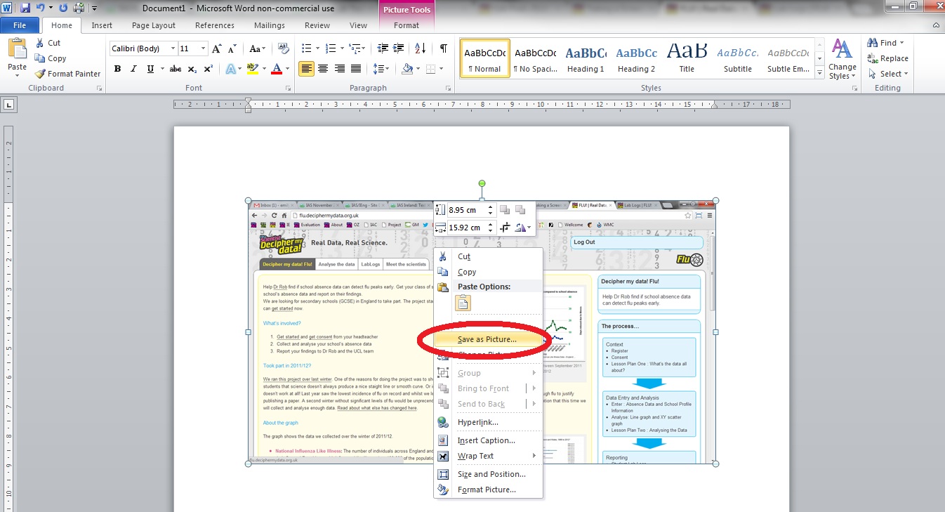
Saving as a jpeg using Word

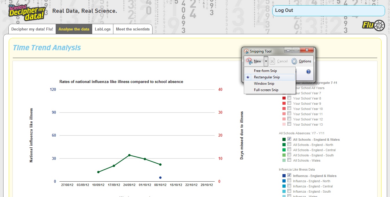
The best and easiest way to get a capture would be to use a tool which will allow you to ‘grab’ or ‘snip’ a specific part of the page. If the tool isn’t directly in your menu, just do a quick search and it should appear. In Windows it’s called ‘Snipping Tool

Snipping Tool for Windows

Select the area you want to capture and it will appear in a window for you to edit.
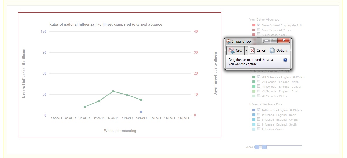
Select the area you want to capture

Remember to save the image capture as jpeg so you can use it later in your reports.
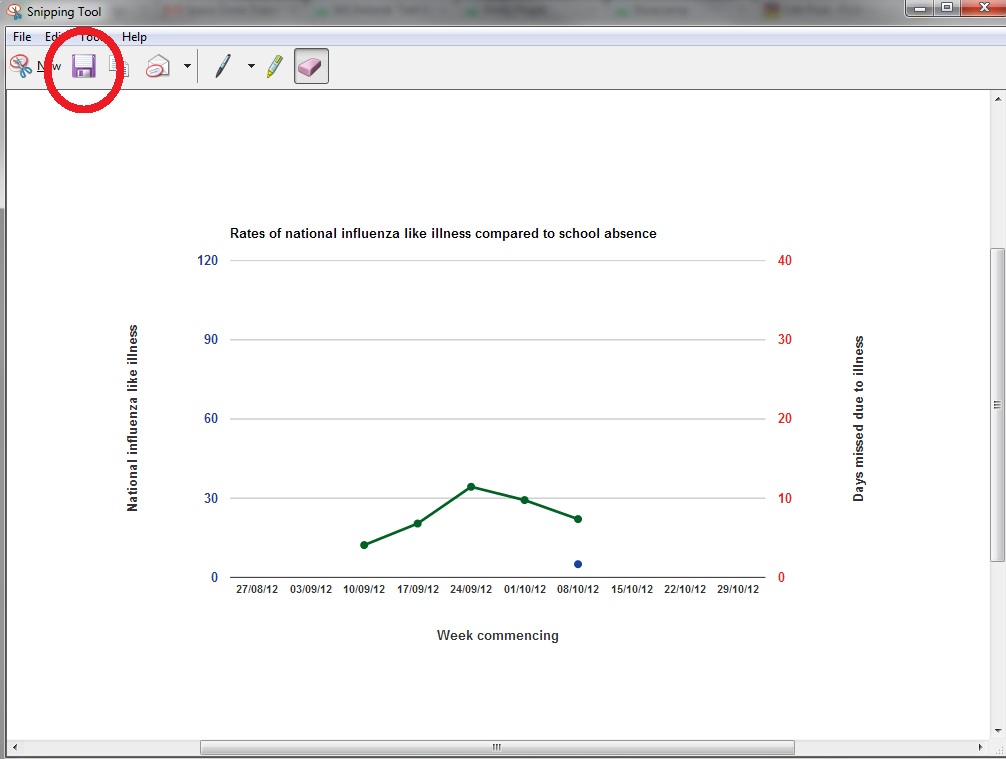
Save the file as a jpeg

Adding your screenshot to a LabLogs

To add an image to your LabLog, you’ll first need to make sure you’re logged in to the site!

LabLogs on the menu bar

You’ll need to click on the ‘Upload/Insert’ button.
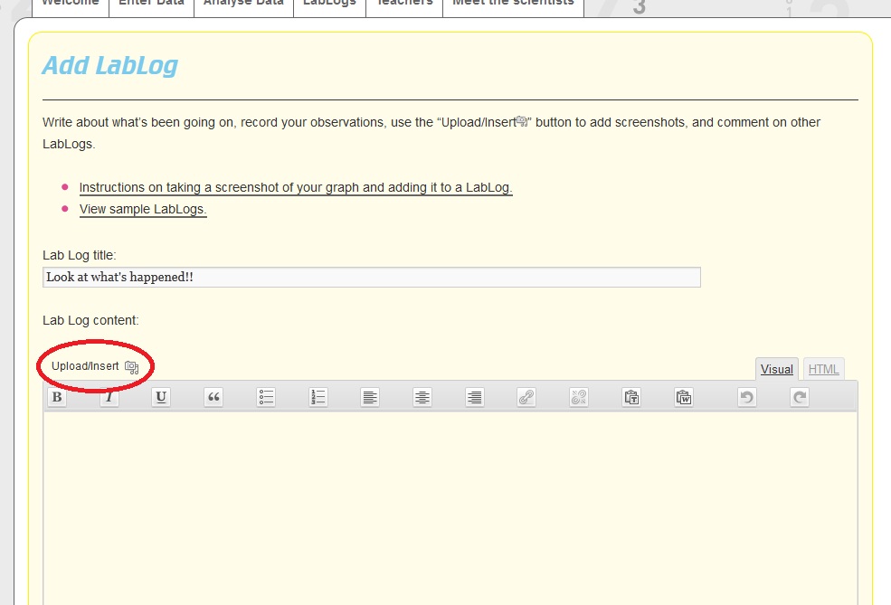
The Upload/Insert button

A box will appear asking you to either ‘upload’ or ‘drop’ your image from your computer on to the site.
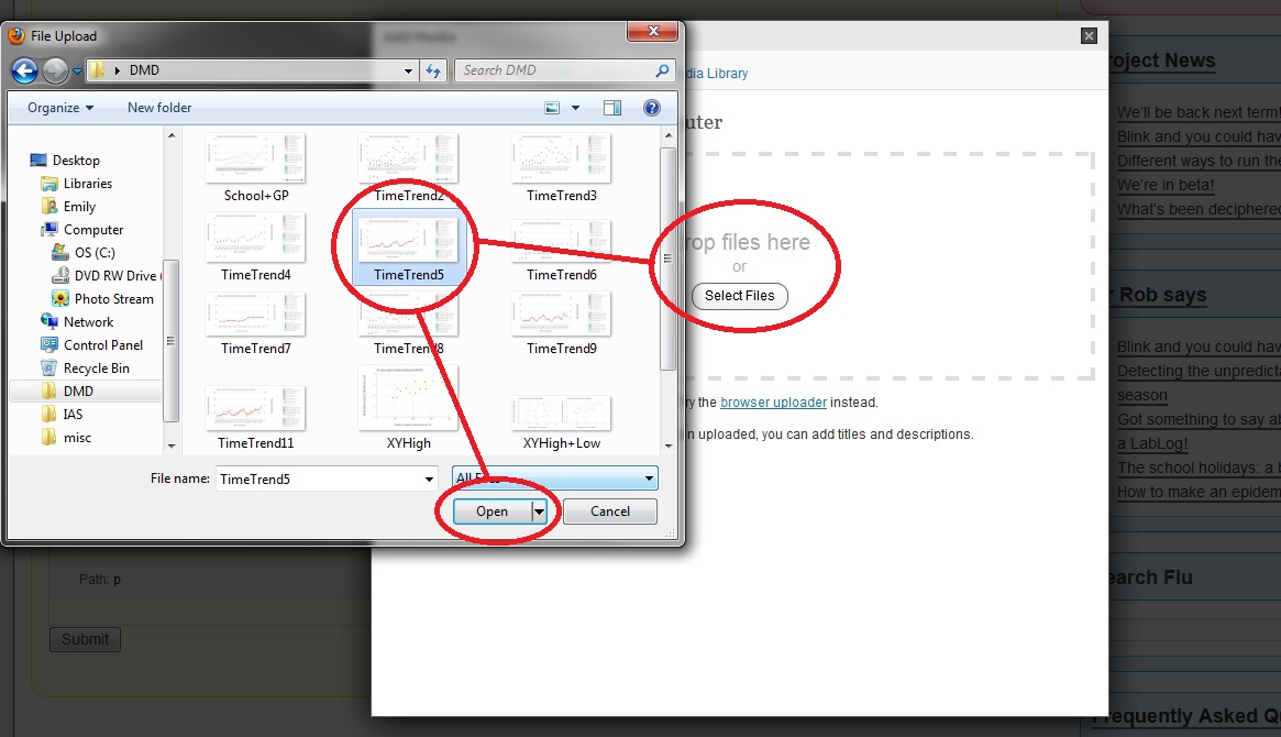
Find the correct file

Once your image has been uploaded on to the site, make sure you “INSERT INTO POST” and then “save all changes”
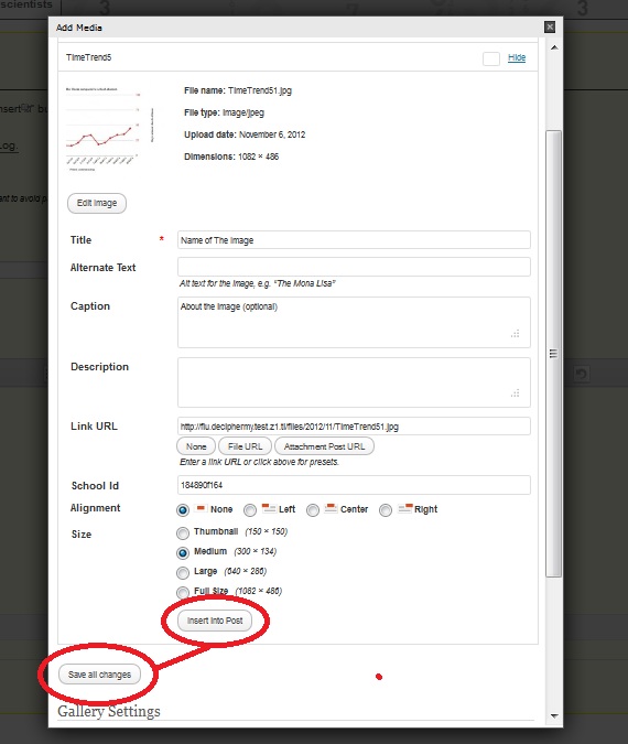
Change the image settings

Alternatively you might already have an image uploaded, and just need to find it on the site, in which case – click on the Upload/Insert icon and click on ‘Media Library‘.
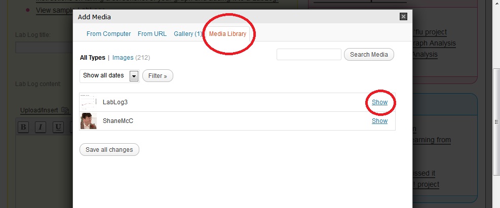
Click on !Media Library and ‘show’ the image you want to add to the LabLog.

Remember to ‘Insert into post” and “Save all changes”.
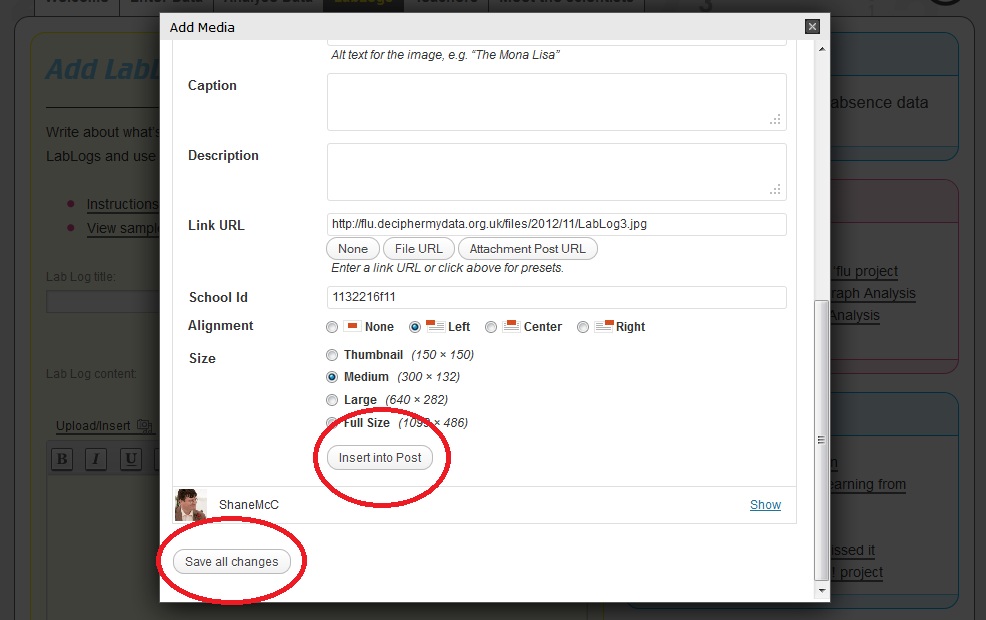
Make sure you click on “Insert into Post”

You should now see your image, add some text and remember to click ‘submit’ so that everyone can see it!
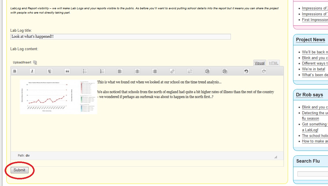
Submit your LabLog!

Once you’ve clicked ‘submit’ you’ll be taken back to the LabLog page, and you should see a text box with “Your LabLog has been submitted for moderation. It will be published as soon as possible.” – When it’s been checked, it’ll be live on the site, for all to see!

If you’re using an Apple Mac, or an iPad , the commands may be slightly different, click here for more information.

Posted on by modemily | Leave a comment

Flu scientists get colds too!

Washing hands can help prevent us catching the influenza virus. Image by Christian Hartmann.

Washing hands can help prevent us catching the influenza virus. Image by Christian Hartmann.

A few people at work have come down with colds over the last couple of weeks. So far I’ve managed to avoid getting unwell, possibly because my years of working on a hospital ward have left their mark in the form of a reflex washing of my hands whenever I’m near a sink…..

It’s unlikely that many (if any) of my colleagues have influenza as the latest HPA surveillance report shows that levels are currently low. Each week the HPA receives samples from around the country which they then test for respiratory viruses. For the week ending 4 November 2012 only 17 (2.5%) of the 669 the specimens they received were positive for influenza which is still low.

They test these samples for other respiratory viruses and at the moment there are other viruses around such as human metapneumovirus, rhinovirus, respiratory syncytial virus, parainfluenza and adenovirus.  It’s more likely that one or more of these are cause of the symptoms in my office.

If you’re interested in finding out a bit more about the difference between a cold and the flu then have a look at this interesting video here which also describes how to stop them spreading and when to go and see a doctor.

Our ‘Decipher my data’ results obviously won’t be able to distinguish between these different viruses as we’re not doing any testing of respiratory samples. Instead, we’ll be looking at these national data collected by the HPA to see if there are any correlations between peaks that we spot in our graphs and the national surveillance results. Obviously this requires us to have some data, and it’s great to see that some schools have started uploading their school absence levels. However, we’ll need more than we have at present if we’re going to spot that peak if and when it occurs, so please do start uploading as soon as you can.

Posted on by Dr Rob | Leave a comment

Declan talks to the Guardian

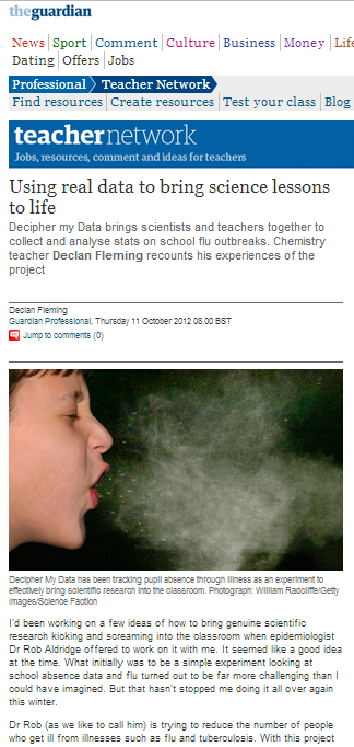
I hope you’ve all picked up your (Internet) copy of the Guardian! This week Declan wrote an article for the Guardian’s Teacher Network, (a massive online source of news, events and jobs for teachers).

He wrote about how the project, despite not going to plan in its first year (having been the weakest flu season on record), is a fantastic opportunity for students to work with real data and for “teachers to teach how science works from the other side of the looking glass..

You can read the article in full here!

If you’ve read the article, what did you think? Are you interested in taking part as a teacher?

If you have any questions just leave a comment here, email us, or leave a comment on twitter (@deciphermydata) with the hashtag #dmdflu.

The project has launched, but we’re still keen for English schools to take part, all we ask is that your headteacher signs off on it (get your consent forms here).

Posted on by modemily | Leave a comment

Watching for flu – we need your data

The big news keeping us flu watchers busy this week is the new coronavirus contracted by a patient from the Middle East who recently arrived in the UK. We’re interested because it is new and the only other person known to have been infected with it died, so it’s not something to be taken lightly. Improvements in science mean that the Health Protection Agency have been impressively quick at working out the genetic sequence of the new virus so that we scientists can start researching it and working out ways to beat it. The good news is that at present we can’t see it spreading from person to person – if you’re interested in this topic then you can read more about it here.

We’ve also been looking out for the seasonal strains of flu over the summer. As usual there’s not much about at this time of the year, but we are getting close to when we would normally expect a flu season to start. To establish a baseline we’re asking our Decipher My Data schools to start uploading data this week. Without these data we won’t be able to see a rise due to flu, and without your consent forms we won’t be able to accept your data. Sorry for the extra hassle but as a genuine medical research study, ethical procedures have to be stuck to.

If you have any questions, leave a reply (below), email us, or give us a ring.

Posted on by Dr Rob | Leave a comment

Consent form sent in finally

I’ve been so busy with all the usual business at the start of term I nearly forgot to return my consent form. The head was able to OK it on the spot. Now I just need to get it sent back and get our lovely absence officer to send me over the first month’s absence details from the script we now have on our system.

Friends have been asking me about whether there is any data yet as a lot of people have been ill in their schools and I’m already seeing a lot of Facebook and Twitter statuses talking about people getting ill. It’s likely that what’s going around is just part of the baseline level of illness we established last season but it will be interesting to see for sure – especially as many see people around them getting ill and immediately assume that there must be something big happening!

The only way to know what’s going on is to get as many people uploading their data as possible. Now’s the time!

If you have any questions, leave a reply (below), email us, or give us a ring.

Posted on by Declan | Leave a comment

Flu over the summer

Decipher my data wasn’t collecting absence levels over the summer as schools were on holiday and there typically isn’t much flu around during this time. However, research and public health work preparing for the flu season goes on, so what have you missed? Two important stories emerged during the break: the first around vaccinating school children against flu; and the second is the discovery of a new strain of influenza identified in the USA.

Vacinating children against influenza

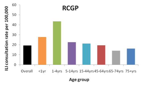
Children and young adults are a particularly important group for the spread of flu. Last year, levels were very low, but it was children aged 1-4 years that went to see their GP with a ‘flu like illness’ the most (See Figure 1 below). Similarly, during the recent flu pandemic in 2009/10, it was children aged 5-14 that had the highest rates of disease confirmed by tests for the virus.

These laboratory and surveillance data have been used in simulations of the spread of flu. These computer models have shown that children and young adults play a pivotal role in the spread of the virus in the general population and that vaccinating children against flu could reduce this spread. The research has also shown that preventing cases of flu in children can also help avert cases in those groups at greatest risk of complications, such as the elderly, or those with chronic medical conditions.

For this reason, the government recently announced that it plans to introduce an annual vaccination campaign of all children aged two to 17 in England. It is hoped that when introduced, this will result in 11,000 fewer hospitalisations and 2,000 fewer deaths each year. This vaccination campaign in children won’t start for several years, but when it does we think that decipher my data might be able to provide some useful data to help evaluate whether it works when implemented in practice, so watch this space!

Figure 1: Peak GP ILI consultation rates by age group in England (RCGP), 2011/12

Figure 1: Peak GP ILI consultation rates by age group in England (RCGP), 2011/12. Source: HPA

Flu from abroad

Public health doctors and researchers in the UK tend to watch what’s happening around the rest of the world quite closely over our summer because, as the recent swine flu pandemic demonstrated, infections can spread very rapidly due to air travel. Because of this, a recent development that’s received lots of attention in the news is the emergence of a novel swine-origin influenza A(H3N2)v virus in the USA. Those affected have mostly had contact with pigs and the risk of infection to the UK population is assessed to be very low.

We’ll be watching this and any other developments over the coming weeks and I’ll try to point out interesting flu related news in these blog posts. Like last year, we can’t and won’t try to predict what will happen during the forthcoming flu season, but we’re certain that the students involved will be helping us decipher their school’s data.

Posted on by Dr Rob | Leave a comment

Why can’t I register with my old email address?

If you’ve previously registered on DecipherMyData, then we will still have your details on the system. You can use the same account, however you will still need to get consent from your headteacher again. Alternatively if you’d rather set up a new account, you will need to supply a different email address.

Posted on by modemily | Leave a comment