The way a graph is drawn can have a big influence on how the results are interpreted. In this lab log Dr Rob discusses some of the dangers in drawing graphs with DecipherMyData .
Most of the analyses we’ll be doing in DecipherMyData involves drawing graphs as there aren’t many statistical tests we can perform to help us investigate whether the project has worked or not. Instead we’ll describe the associations we see (or don’t see) between the school absence data, measures of flu or other viruses.
One of the risks when analyzing data with graphs is that you can come to very different conclusions just by drawing the graphs in different ways, and not because of any changes to the data. This is easiest to explain with an example, so here’s a simplified version of the graph I created in my last lab log.
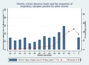
I think this graph shows some association between our school absence data and flu, particularly in the later weeks.
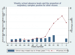
However, I can make the association look much weaker by changing the scale of the axis for the school data (the y-axis on the left) like this.

Changing the left hand y-axis on this graph to reduce the association between school absence and flu
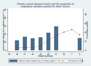
And if I remove the first few weeks of data on the x-axis, but keep the original y-axis scales.…
I think this makes the association between the school absence data look stronger as it gets rid of bumps in the school data that we see at the beginning of the year.
Unfortunately there’s no right or wrong answer for choosing how to present your results, but some ways are clearly more truthful than others. It’s also possible to get this wrong by accident if you’re not careful.
There are no hard and fast rules when putting together graphs like the ones above (epidemiologist call them time series graphs), but here are a couple of things I think about:
- What scale for the axis? This is important, and sometimes involves drawing the graphs several times with different scales to see how they look. In general the scale should always start at zero, and go slightly higher than the largest value.
- How much data to include? It’s important to present all the data that you have, but balanced against the fact that too much data makes a graph over complicated. In general simpler is better, but think carefully about what not to present.
- Should you present the data as bars or lines? This is a matter of preference, but in general I try to use bar graphs for time series data. However, when there are lots of data points (like in the previous graph) then lines are more appropriate otherwise the graph becomes confusing.
- Is it ok to use scale breaks? A scale break is an intentional break in an axis that can be used to improve the readability of data. These are usually inappropriate as they almost always exaggerate associations between data, so I tend to avoid them wherever possible.
If you’re interested in this topic there’s also a great Wikipedia page on misleading graphs that’s worth reading.
I’d love to know what you think about my graphs. Do you think I’ve chosen the best scales and axis for the data? Should I have used a scale break or not? Have a put too many things on the graphs? Let me know in the lab logs or writing a comment on mine.


