
Are School Absences Correlated with Influenza Surveillance Data in England? Results from Decipher My Data — A Research Project Conducted through Scientific Engagement with Schools
Are School Absences Correlated with
Influenza Surveillance Data in England?
Dr Rob has had the paper published in the open access journal PLOSOne. We’re very proud that with the support of the 28 schools who contributed to Decipher my Data – Flu we have been published.
Thank you to all the teachers, students and school administrators who made it happen.
The project is over.. And the results are in…
Now the project has finished, and Dr Rob is completing his report and paper on Flu, we will finally see the answer to the questions we asked when we started..
“Can school illness absence data could help us predict flu peaks earlier than other methods? “.
After two years of collecting and analysing the data, we have finally compiled an evaluation report on the project as a whole. In a nutshell.. did Flu! work? Read the Decipher my Data, Flu report here.
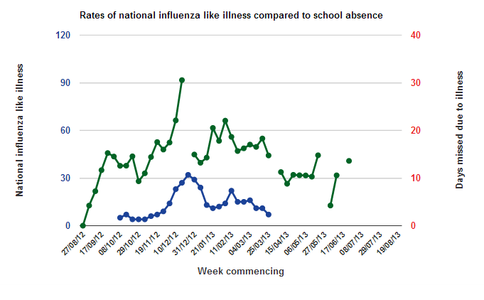
WARNING – Please read the following about the data on this graph:
The graph you’re looking at is a snapshot of the data we’re collected over the year 2012-2013. We are making this information available publicly as we want to open up research to the public, showing it in a new and exciting way. However, this is research project, which means we don’t yet know what the data is telling us, we’re still deciphering that.
Because of this you need to be very cautious when looking at the graph. If there’s a blip or a dip in the data, it could be real, it could be an error, or it could be caused by something completely unrelated to flu. Therefore, please don’t use the graph to try and work out whether there is an outbreak of influenza occurring. If you want to know what’s going on with the levels of flu in England and Wales then you should check Health Protection Agency reports here.
About the top graph
The graph shows the data collected by schools from August 2012 to August 2013.
- National Influenza Like Illness: The number of individuals across England going to see their General Practitioner with Influenza Like Illness (per 100,000 of the population). This is data collected by the Royal College of General Practitioners (RCGP) and is one of the best indicators for flu activity (read more about it here).
- Days missed due to illness: National school data showing the number of days missed due to illness (per 100 students).
