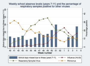
In week four there was an increase in the number of school absences, similar to a peak just before the Christmas holiday. Was this due to flu, or are there other possible explanations?

Weekly school absence levels and the proportion of respiratory samples positive for other viruses up to week four
It would be fair to say that Shane and I had a fairly nervous but exciting telephone conversation last week. Our absence data for week four was showing a peak similar to the one just before Christmas when the levels of flu from national surveillance systems were high. Did this new peak suggest that we were about to see a second peak in flu this season when the national flu indicators were all still low?

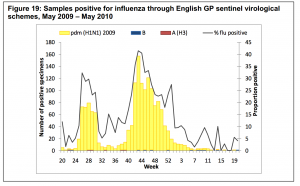
Graph of swine flu data showing a peak just before the school holidays and another peak just after school return. Graph taken from the HPA National Influenza Annual Report.
This wouldn’t be the first time that there’s been a second peak of flu in one season. During the swine flu pandemic, levels of flu were very high just before the summer holidays. Schools broke up, levels dropped during the holidays, and then peaked again a couple of weeks after the start of the new school year in September. These and other results show just how important we think schools are in the spread of flu.
So what’s going on during week four in our schools data? Before epidemiologists consider something as being a real effect, or truth, we like to consider some other possible explanations for our findings:
- Error – did someone accidently put in the wrong data for that week? This is a possibility, but all schools submitting data at the time showed an increase, even if some were greater than others.
- Chance – could the blip be due to a fluke in the data? When I first looked at the results, the peak was quite large, but we were not sure whether it was truly higher than background levels. As more schools have submitted their data, the peak has gradually come down closer to the background levels (you can see the live data here) and we still cannot be certain that it is really different to the background levels.
- Bias – are the results from schools taking part in decipher my data different in some systematic way from other schools around the country? Are they better performing academically? Are they in less deprived areas? Are they all in the South of England? I’m going to examine some of these issues in detail over the next couple of weeks and don’t have any definite answers yet as new schools are still beginning to join the project.
- Confounding – is there an alternative factor that explains the peak in school absence data other than flu? We don’t collect information on the illness, so could the blip in data be due to something like Norovirus (there’s lots around at the moment) or another respiratory infection like RSV?
So there are a few possible alternative explanations for the blip and right now the honest answer is that I’m not sure whether it was really due to flu or not, but my feeling is that it was due to chance. This little bump in the data has given me a lot to think about though especially as the national flu data was quite low during that week and I’m certainly going to be watching the data closely over the next few weeks to see how things progress.


