There is now a new data analysis tool on the site; XY scatter grap hs. These graphs will help you examine whether school absence due to flu is linked to variables, including percentage of pupils on free school meals and average age of school buildings.
We haven’t seen a peak in national flu, yet. This means school absence can’t be attributed to flu and so I’ll be waiting for a flu peak before I get too carried away analysing the XY scatter graphs.
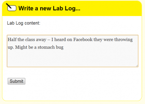
The science team and I at UCL are still keeping a close eye on the flu! data. However any comments and observations you have will bring fresh insights, and you may well spot something we haven’t. If you’re a consented teacher or student you can now record your observations in a LabLogs. I’ll read and reply to your LabLogs, giving us a chance to discuss and analyse the data together.
You might want to tell me about some data that’s looking dodgy. For instance, if a school has entered data for the coming week, which hasn’t yet finished. Anything that looks a bit strange, write it in a LabLog and we’ll look into it.
Alternatively, you might want to add in some local knowledge to help explain your school’s absence data. Whether you notice that absence increased during a cold spell or that teachers also got sick as student absence increased, this information could provide some exciting insights.
LabLogs are also used in the time trend analysis section of Lesson Two, where students enter their own observations and potential explanations. To ensure school anonymity is protected, LabLogs are strictly moderated and only visible to a school’s teacher and students.


