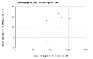
I’ve just had an email from the DMD team to let me know that the XY scatter graphs are live and that I could have a play around and give my thoughts.
The purpose of the XY scatter graphs is to investigate whether school absence due to flu is linked to the four variables. So the first thing to keep in mind, is that we’ve not seen a peak in national flu, yet. This means school absence can’t be attributed to flu and so I’ll be waiting for a flu outbreak before doing this activity with my students.
When you open it, you can see how the different school-based variables correlate (or not!) with the national school absence data.
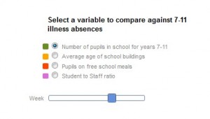
The variables are taken from my school profile and appear on the X axis of the scatter graph. Some variables have been filled in by lots of schools, whereas other variables need to be filled by more schools to make them worthwhile. Having more information for some variables compared to others isn’t all bad, as it presents an opportunity for my students to talk about data quality.
Scanning through the weeks, patterns appear and then collapse into chaos, which I believe is caused by variations in different schools’ absence data. It’ll be really cool to see whether any patterns hold up if flu peaks.
My students will have the How good is your correlation resource, when I cover Lesson Two which will show how strong any correlations in the data are. After the lesson, I’ll be asking my students to record their observations, explanations and comments in a LabLog for homework. These are kind of like a Facebook “wall” where students can post their observations.
One of my students asked about whether there is any connection between our susceptibility to flu and temperature – I passed this on to Dr Rob through the “Ask a scientists” function. It was great to see a really informed answer and I loved the fact that my year 8s could keep Dr Rob on his toes, as he had to do a literature search before he could answer!


