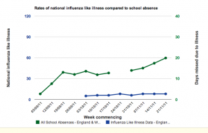
 After months of planning and hard work we’ve got some data! There’s now a graph on the welcome page for you to look at, this is being updated with data as it comes in. Because it’s live data don’t be surprised if the numbers jump around a bit, and like us, you’ll need to be very cautious interpreting what you see on the graph. A big thanks to all the schools that have got us off to this great start, it’s really fantastic and has made my week.
Schools uploading their data so far have been great in back dating it to the beginning of the year. This is really helpful as it allows us to establish what sort of range we can expect levels of school illness to vary between whilst there are low levels of flu in the community. The more data that schools enter, the greater certainty we’ll have about this baseline level which is important as it helps us know when there might be a peak.
At the moment we have more data from schools in the south of England, so we have a problem with selection bias when interpreting our data. Therefore it’s important that schools in other regions submit their data in order for our results to be representive of the national picture in England and Wales. This will also make the analysis your class carries out much more interesting when you look at it.
I’ve explained in a previous blog what the axis on the graph mean. However, the previous graph showed data from just one school and what you’re looking at now are summary results from schools across the country.
The blue line at the bottom of the graph shows that the number of people going to see their GP with a flu like illness (levels of influenza) in England and Wales were low for these weeks. If you want to find out more then you can always read the weekly Health Protection Agency updates.


