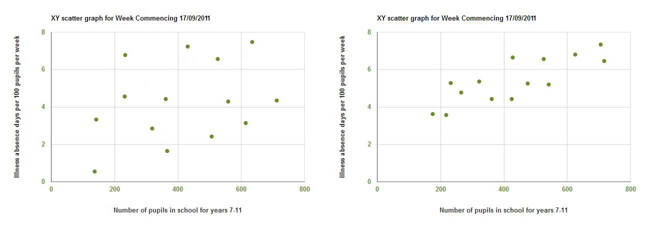
 Scanning through the weeks on the x-y scattergraph there seems to be a correlation between the number of students and the illness but it seems to come and go. When the pattern is present, it seems that the more students a school has, the higher their illness rate. This could because more students transmit the illness more effectively between each other. It’s possible that in larger schools, students are kept in closer proximity to each other but without information on the physical size of the school there’s no way I could make any firm statements about that. It might be interesting to look at. On weeks where there is low absence, the patterns is not very clear. This is probably because there is too little illness to get a clear pattern – there is too much variation in the data. When there is more illness there is a fairly good correlation.
NEWS UPDATE!
Decipher my data! Flu!
Help Dr Rob find if school absence data can detect flu peaks early.
The process…
Search Flu


