If you’re a student, running the Decipher my data! Flu! project is your chance to experience doing some real science, which will give you something exciting to talk about in your UCAS applications, personal statements and interviews. You should talk to your teacher about the project but using the resources below, it is possible to run the project with minimal input from your teacher. Here’s a video from Dr Rob, he’ll be around through the project to help answer any questions you may have.
Your Project Resources
Here are a list of resources you’ll need throughout the three phases of the project.
1. Context:
Registration and Ethical Consent
- Register: Your teacher needs to register your school’s account.
- Consent: For ethical reasons, your teacher needs to return a consent form signed by your headteacher.
- You can be involved in the process of gaining consent by putting together a presentation with your fellow students for your schools ethics committee. You could discuss the ethics behind scientific research and why this research is important, using the resources below.
- Once your teacher has registered and sent in your school’s consent form, you will then be able to register an account using your school’s student registration page
- Some students can be upgraded to a Trusted Student; this will allow you to upload your school’s data. If you’re interested in becoming a Trusted Student, ask your teacher to email: flu@deciphermydata.org.uk with your student usernames
Resources
- Dr Rob’s Blog: The green light at the end of the tunnel
- Dr Rob’s Video Above
- Flu cards: DMD1.1 “Flu: The Numbers” Cards with numbers and corresponding descriptions to match them with. These indicate what impact flu has on your lives and the lives of people in the wider community.
- NHS video clip web clip and further information
- HPA influenza fact sheet for schools
- More detailed HPA information
- You can use these resources to answer the questions provided here DMD1.2 Questions on the Flu Video
Relationships between variables:
- To analyse the data you collect in the project, you’ll need to understand different types of variables.
Resources
- Article: DMD1.3 “The Daily Wail” Newspaper Article. This describes a shock new discovery – scientists have found a connection between seaside drownings and numbers of people who ate ice cream in the last 24 hours. You can criticise this article and suggest why there may in fact be no cause for concern. This involves understanding the idea of a confounding variable, which provides an alternative explanation for an effect seen in your dependent – or outcome – variable. Ben Goldacre has written a helpful comment column explaining some of the issues.
- Examples of relationships in data: (DMD1.4 “Relationships”). You can discuss the figures and suggest whether there is a causal relationship or whether the variables are only associated by other confounding variables. The data on this sheet is fabricated. The first graph hints that the popularity of the sea as a retirement destination. The second graph is based loosely on the Institute for Fiscal Studies (IFS) and Institute of Education research showing that August babies do less well at school (especially earlier on) as they are nearly a year behind in development compared to other children in the class. The third graph is real but shows nothing more than “where there are people there are phone masts”. The final graph is a nod to “Pastafarianism”.
- Sheet: DMD1.5 “Variables”. You can discuss and decide what impact each variable will have on the data and why. There is space for you to add additional variables. You could also identify the type of variable and consider which variables you think will have the largest effect on the numbers of people getting ill.
2. Field work
Data collection:
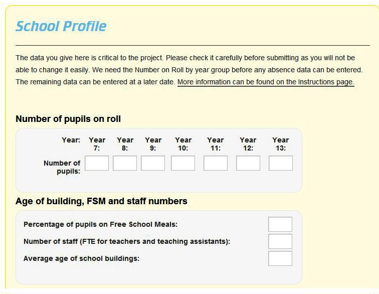
- Enter your School’s Profile information, you may need to go through thi s with your teacher
- Collect your school’s weekly absence due to illness data, read here for more information. Your teacher will need to enter this data, unless you are a Trusted Student.
Data Analysis:
- Here you can get practice identifying patterns in data and suggest explanations for these patterns using example data:
Resources
- Example data: DMD2-1. You can us
 e this to describe small and larger trends you see. Can you work out what the graph represents? There aren’t any right or wrong answers about this data, most observations could have more than one plausible answer (e.g. are the Monday peaks from people feeling fed up on Mondays or from people updating their statuses after the weekend?)
 - Once you’ve looked and discussed the example data, read what this data actually is here
Descriptive time trend analysis:
- This means describing how a variable changes over time. Here you can look for and attempt to explain patterns, natural variation and anomalies in the data.
- You can use the data analysis

tools on the DMD website, there are two types of data analysis to do: Descriptive time trend analysis and scattergraph analysis.
Resources
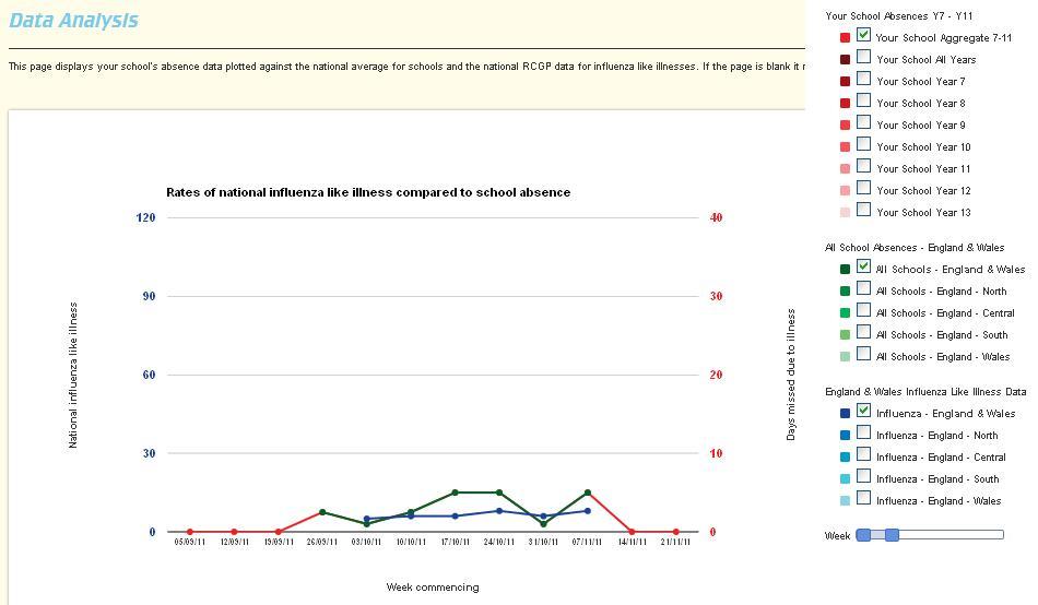
- Line graph: You’ll need to look at the line graph to compare visits to GPs reporting influenza-like illness with the illness absence data from your own school and other schools.
- You can use these key questions to get you thinking about the data DMD2-3: Analysis Questions and add your own questions
- Watch Dr Rob’s video on Analysing Data, which highlights some of the issues surrounding the data
- Read Dr Rob’s blog Whats been deciphered so far
- Using the line graph you can switch on or off multiple data sets by deselecting boxes. You can then describe the data and come up with your own potential explanation for the patterns you find. You can take a screenshot of the graph you are looking at and comments on it to a “LabLog” on the site.
- Sheet: DMD2-2: Analysing the Data Level Ladder to help you put together a Lablog
Scattergraph analysis:
- Here you will look at the correlation between nationwide school illness absence data and the core variables collected in the school profiles for the week that absence data is at it’s peak (e.g. core variables include size of school, staff/student ratios, age of buildings).
Resources
- XY Scattergraph: you can use the data to plot an x-y scattergraph between years 7-11 schools absence data from across the country and any of the outbreak variables including the hygiene, illness, household, vaccination and transport points. You can make your comparisons for any week but we recommend looking at the week with highest absence in the national schools data as this will give you the most data to play with. Be aware that until the outbreak occurs, the “peak” week may not have anything to do with flu but it will still be of interest to Rob and his team.
- You can save your observations, explanations and comments on the quality of data in your LabLogs
- Sheet: DMD2-4: How good is your correlation? Here you can look at the strength of your correlations
- You can discuss the distribution of your data by calculating the: mean, median, mode, minimum, maximum to describe the data. For example, is the mean greater than the median and if so why?
3. Reporting and reviewing:
Reporting
Here you will learn about the processes that a scientist must go through in order to publish their work and explain how this is different to (for example) a newspaper journalist.
Resources
- Video on Peer Review: Journal or Journalist
- After watching the clip, decide and discuss which way of publishing is better for criteria by ticking the appropriate column on this sheet DMD3-1: DMD3-1 Journal or Journalist (PDF) / [Word]
- You might also find this sense about science document useful, showing a day in the life of Andrew Sugden, the editor of Science.
- Board game: Follow the process of getting work published DMD3-2: DMD3-2 The race to publication (PDF) / [Word] (you will need dice and counters). Can you identify one thing that helped you move up the board to get your work published and one thing that hindered you.
Reviewing
You can critically evaluate the quality of other students LabLogs. You can then upload your best observations to DMD for peer review by other schools and for use in Dr Rob’s research.
Resources
- Here you can peer review other students work this level ladder: DMD3-3: DMD3-3 Peer Review Level Ladder (PDF) / [Word]. Grade each others LabLogs/observations according to the DMD2-2 criteria. Respond formally to the work they are reviewing using the level ladder on DMD3-3 to help them grade the quality of their own response. Recommend the LabLog/observation to be forwarded to Dr Rob or suggest further improvements that would be needed first.
- Now decide on a selection of time-trend and XY scatter graph reports to pass on to Dr Rob and his team, who will comment on them and use them in their research. Criteria you could use for selecting the best could include the most unexpected observation, the explanation for a correlation which has the greatest evidence to support it and the highest level observation using the APP criteria. Please send reports into flu@deciphermydata.org.uk.


